Examples
This section presents step by step how to build a query with a few specific examples.
Getting the trend on a long time interval
In the Time Range section, select 1 years ago as relative beginning time.

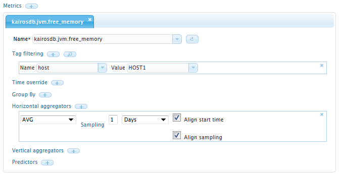
Select the metric name you wish to plot. Create one aggregator, for instance SUM or AVG, and select a sampling of 1 Day.
If you have a lot of different records for that metric, you might want to filter out a specific tag.
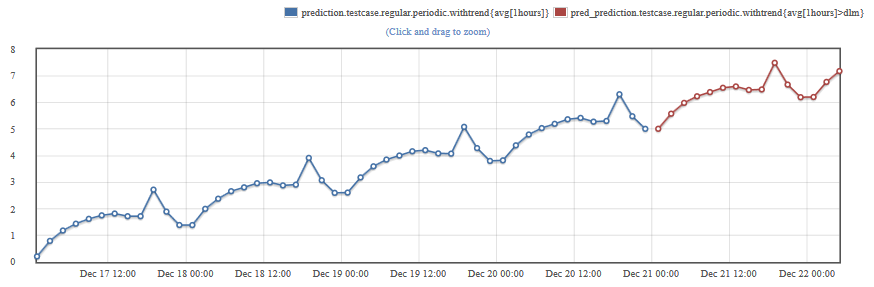
Predicting using a periodic pattern
Select a metric that has a predictable behavior on a given time period.
Aggregate it with the sum or average aggregator so you have only approximately 100 samples and maximum 200 samples (for instance if you are querying on 1 week of time range, use an hourly aggregation).
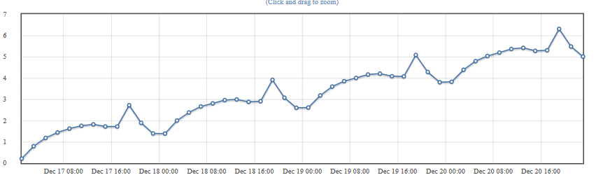
Test your query by graphing it.
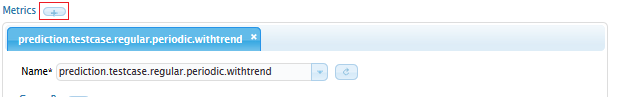
Create a new metric in the same query with exactly the same parameters. To add a new metric click on the + button on top of the metric description:
Add an aggregator, select DYNAMIC LINEAR MODEL, leave the model as Auto and choose 10 or 20 predictions.
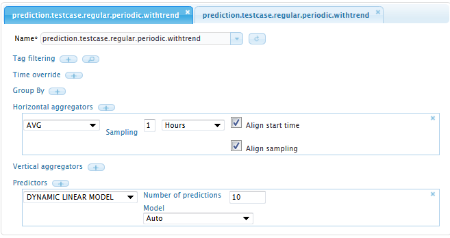
You can now start the prediction. The first metric queried will display the series used for the prediction and the second one the predicted values:
Using group by tag to split series
Most metrics have tags to differentiate data points according to their source or other properties.
To split those series, you should use the group by tag and select an appropriate tag name.

This creates one series for every different value of the given tag.

Using a vertical aggregator can then combine this series together.

This will take the maximum between each series.
The options of the vertical aggregator allow you to choose your policy toward missing samples. If a sample is missing in one of the series, you can discard the aggregate, you can use the latest value of the series where it is missing …
Comparing series at different points in time
Shift series one by one
If you want to compare the behaviour of a series at different times, use the time override and time shift features.
Choose a reference time range. This will be used by the Skyminer to re-synchronize you different samples.
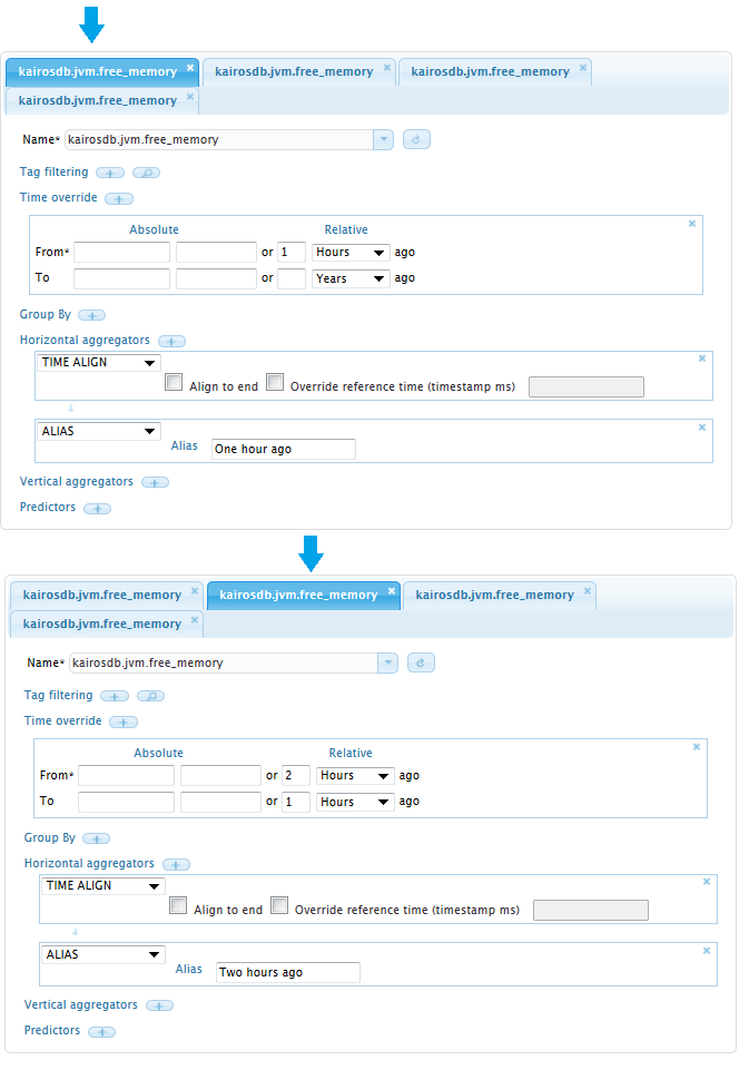
Add a time override in you first metric and choose the time range of your interest.
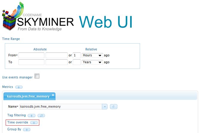
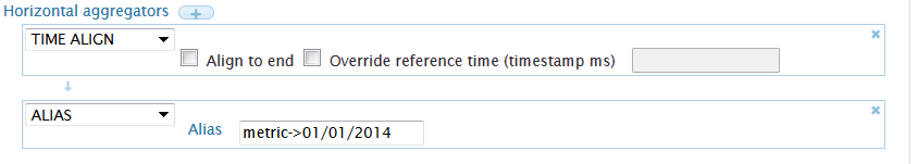
Select the ALIGN TIME aggregator. This will resynchronize your samples to the reference time range. The default option automatically synchronizes your samples to the start of the reference time.

If you want to compare the same metric on multiple time ranges, you should consider using the ALIAS aggregator which allows you to rename your series in order to be able to distinguish different time ranges.
Copy this metric using the add button above of the metric tabs, and choose a new override range to include to you correlation, and if necessary attribute a new alias.
You can combine group_by, query of different metrics, and different time overrides in one query.
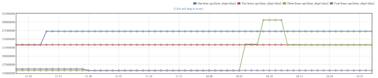
The data can be plotted using the “Graph” button at any time. Note that it will be very time consuming if the query is large, and it will warn you not to plot the query if too many points need to be displayed.
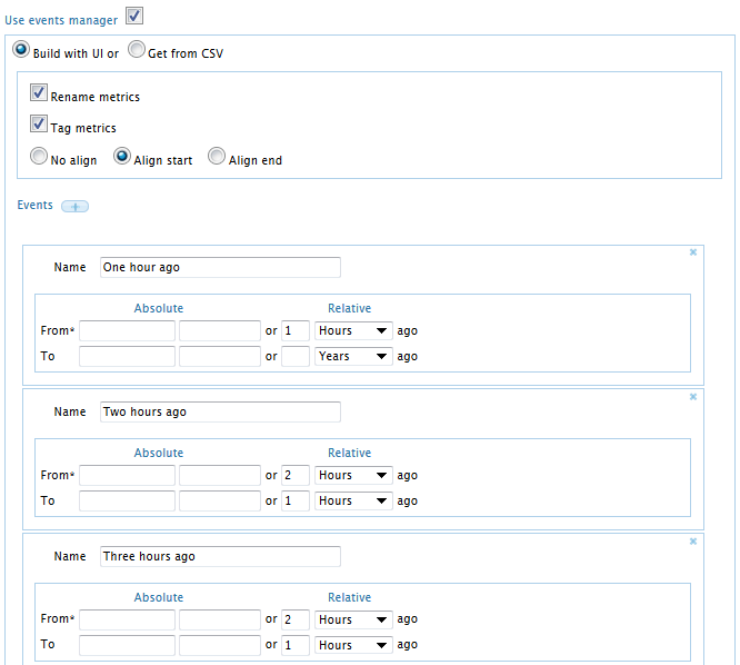
Use the event manager
To compare the values of the series at different points in time, you can also use the event manager. This will automatically duplicate the metric you specify underneath for each event.