Web interface
The query builder
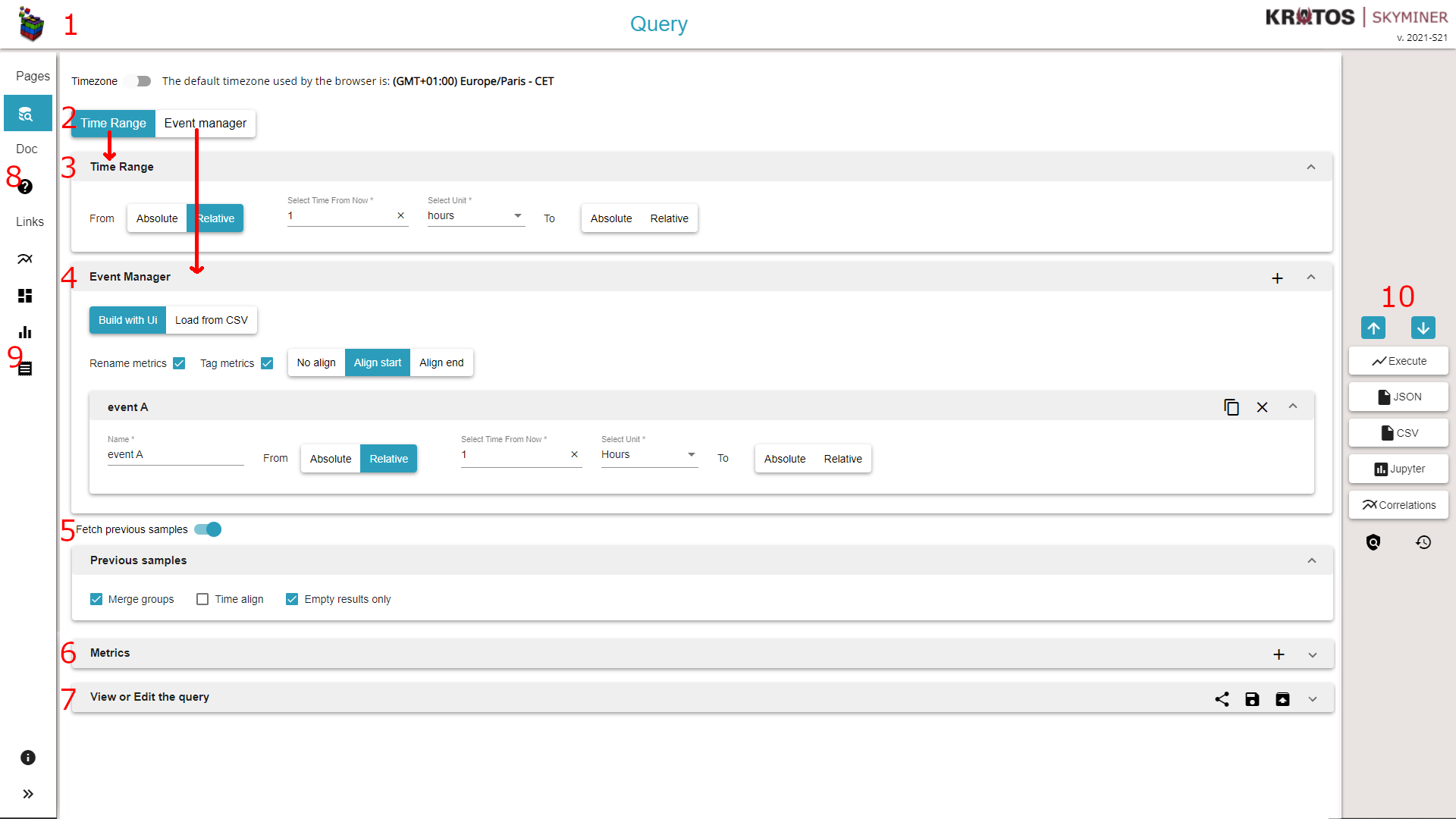
Header, contains the logo and the version number of the deployed release. The logo is clickable and redirects the user to the index of Skyminer Web interface.
The tabs to switch between Time Range and Event Manager
Time range of the query, it can be either a time relative to the current date (for instance 1 hour ago) or an absolute date by picking in the calendar.
The event builder, it is a tool that allows you to duplicate metrics to fetch the data at different times.
Previous samples, this option is designed to retrieve the last known value of the query.
Metrics section, a single query can have different metrics or query the same metric with different processing. This section can be toggled. The + button allows you to add a new empty metric to the list.
The query view, thanks to a double data binding the json query is automatically built during the edition. The right buttons allow you to share, save or load a query.
Link to the Skyminer User Manual
Link to the Skyminer legacy Web interface
This section provides multiple ways to run a query:
Execute the query and display the result data directly in the Skyminer web UI (refer to Select the view used to display the query results)
Save the data in Json format
Save the data in CSV format
Transfer the data to a Jupyter notebook for advanced processing. The notebook must be located located in the ‘Processors’ folder of Jupyter for it to be listed in the Skyminer UI. For more information, refer to Analytics.
These buttons can only be clicked when all the data from the query is valid.
Finally, the padlock icon can be clicked to bypass the safeguards and submit exceptionally large queries. The history icon can be clicked to visualize the executed queries history.
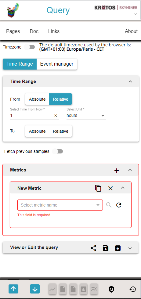
Responsive
If you do not have enough space on the your screen, a slightly different version can be displayed.
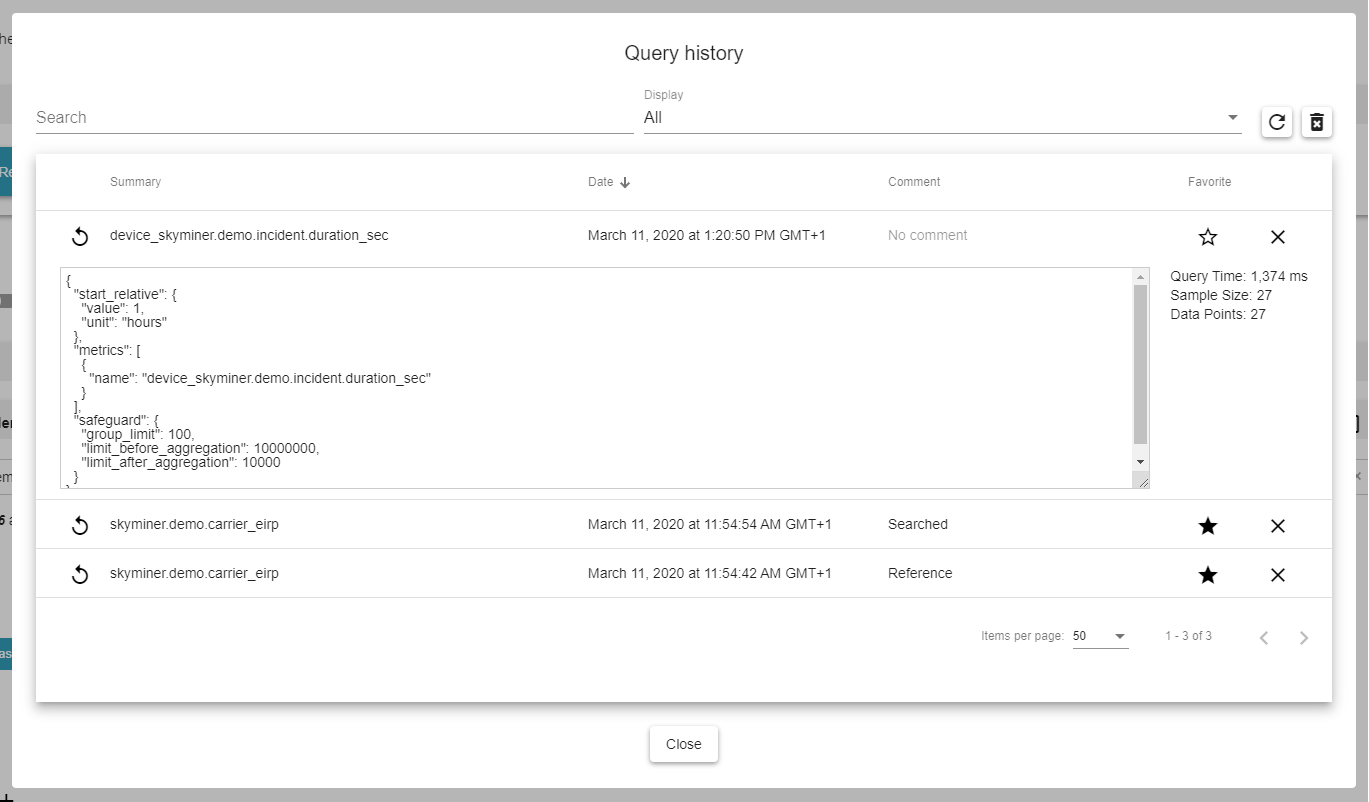
Executed queries history
The history allows you to:
Visualize the up-to-500 last executed different requests
Search for keywords in the query (filters the table)
Import the selected query in the UI (similar to the json query editor)
Remove a query from the history
Clear the entire history
Tag a query as favorite
Favorite queries are not limited in time and number.
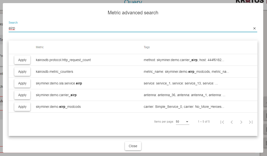
Metric advanced search
The metric advanced search allows you to:
Search for keywords and visualize the matching metric list and their matching tags
Set the metric name by selecting a metric in the table
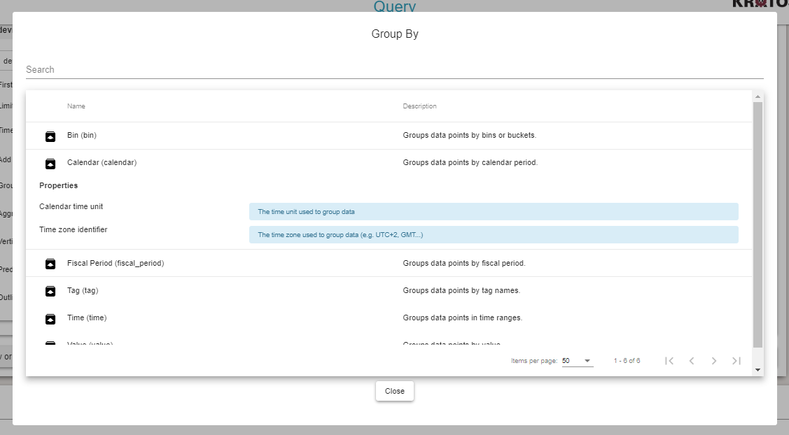
Feature search
The feature search allows you to:
Visualize the feature list and their description
Search for keywords (filters the table)
Import the selected feature in the UI
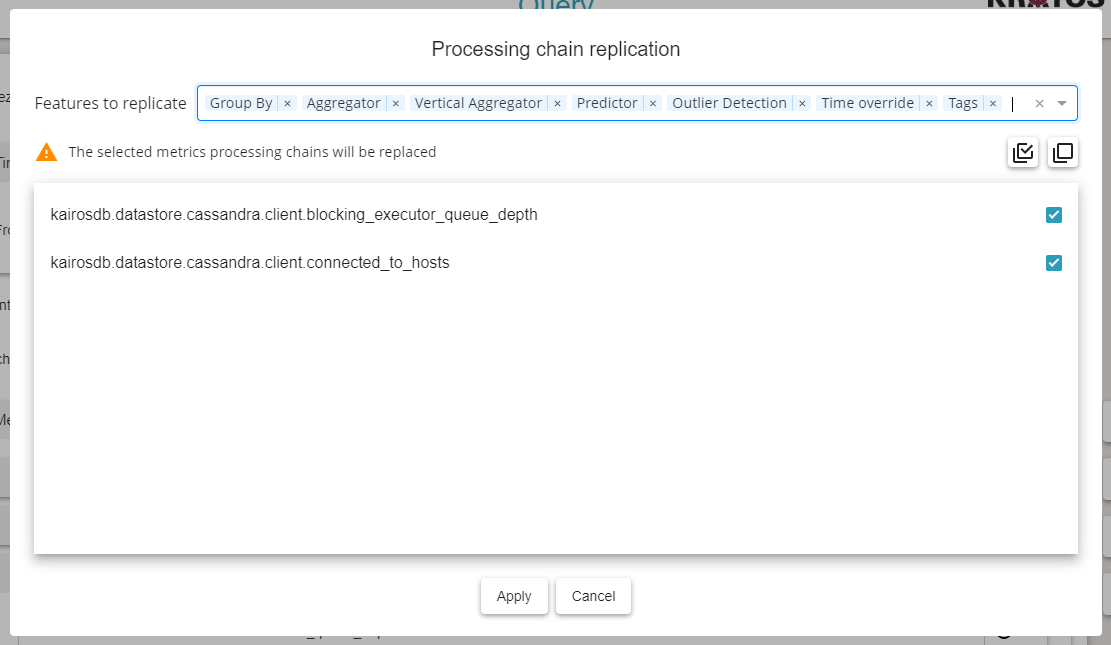
Metric processing chain replication
The metric processing chain replication allows you to replicate the processing chain from a metric to the selected ones. It includes:
Time override
Tag filters
Group-by
Aggregators
Vertical aggregators
Predictors
Outlier detectors
Please keep in mind that replicating a processing chain will replace the selected metrics own processing chains (the current processing chain will be lost).
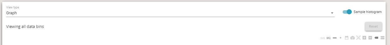
Select the view used to display the query results
The view type selector defines which view is used to display the gathered data.
There are 3 types of view:
Graph type: a graph will be generated displaying the different obtained series (as curves, refer to Generated graph).
Table type: a data table will be generated displaying the samples for the different obtained series (refer to Generated table).
Spectrum type: a spectrum chart will be generated displaying the different traces (refer to Generated spectrum graph).

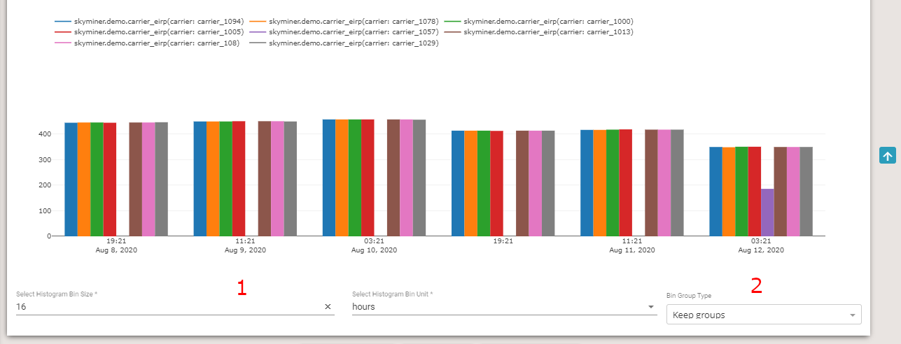
Display the query results sample histogram
The sample histogram shows the sample distribution over time.
Several options are available:
Bin time value and unit: you can configure the ‘bins’ timespan. It is firstly automatically determined using the number of groups and the query time range
Bin group predicate: there are 3 types of histogram group predicate:
Keep groups: a graph will be generated showing the sample distribution by different obtained series.
Group by metrics: a graph will be generated showing the sample distribution by metric name (or defined aliases).
No group: a graph will be generated showing the overall sample distribution.
Clicking on ‘bins’ will focus the query results view on the clicked ‘bin’ timespan:
Graph: a zoom will be applied on the time axis respecting the ‘bin’ bounds
Table: data are filtered by time using the ‘bin’ bounds
You can reset the focus timespan to the query time range by clicking on the ‘Reset’ button.
Generated graph
If the view type named graph is selected, the resulting series are plotted.
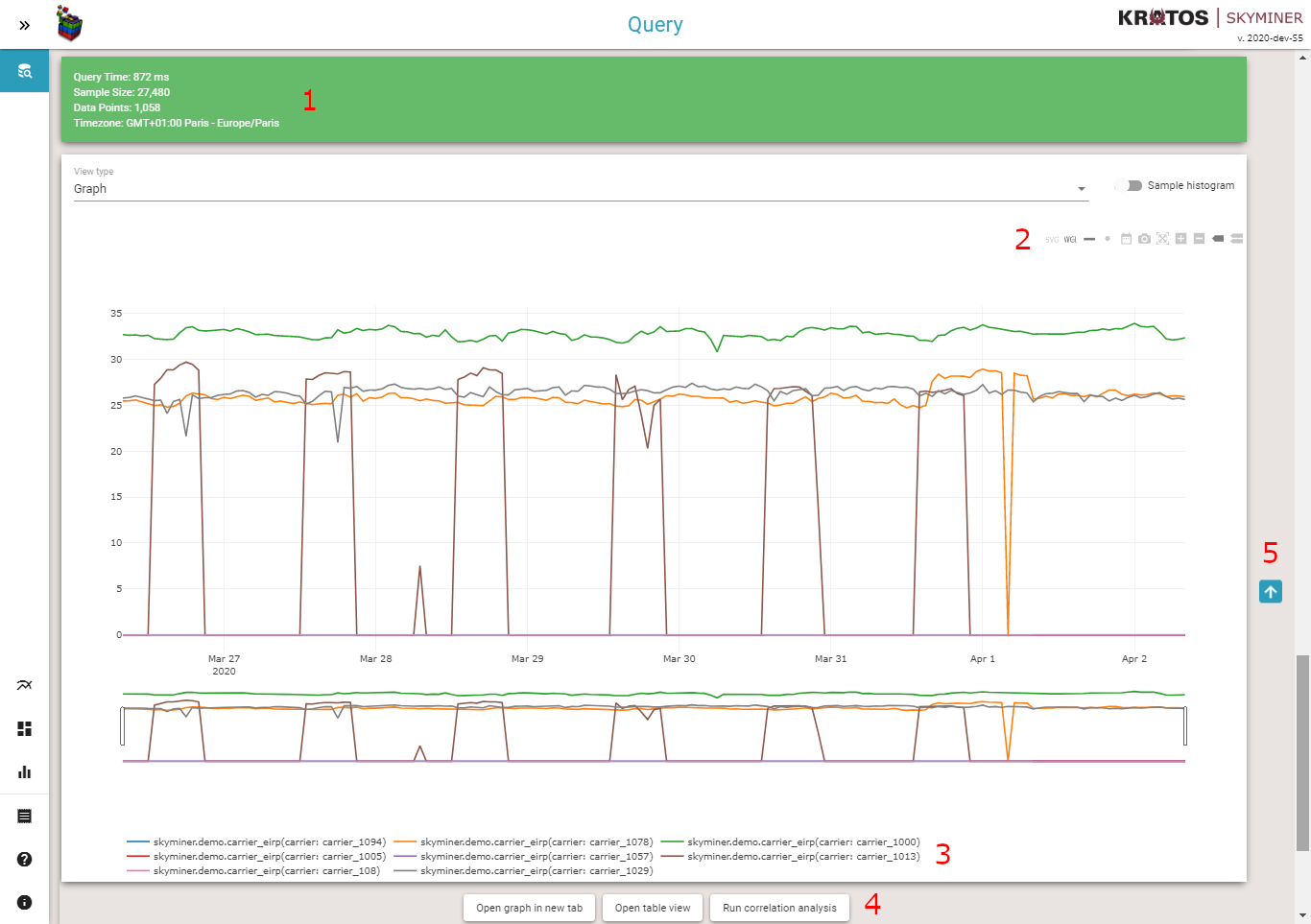
The indicator called Sample Size represents the number of data points that were processed by the query, before aggregation. Data Points are the objects actually returned in the response and plotted after aggregation.
Plot mode bar allows you to customize the displayed plot. There are ten buttons:
Trace type: you can choose to display the plot in SVG or WebGL. WebGL is much more efficient than SVG but may be not supported by all browsers. By default the plot will be displayed in WebGL if the number of data points exceeds 20 000.
Lines mode: you can choose to display lines on the plot, this option is activated by default.
Markers mode: you can choose to display markers (points) on the plot, this option is also activated by default until 5 000 data points count. After this limit displaying markers can considerably affect plot rendering.
Set query timerange: you can define the query timerange from the currently displayed timespan. That eases the focus on a specific area of the plot.
Download plot as png.
Autoscale: you can reset axis and scale with this button.
Zoom In.
Zoom Out.
Show closest data on hover: this option displays additional information about the data point closest to your cursor.
Compare data on hover: this option is activated by default, it allows you to see tooltips for each of your series at a given time in order to compare their value more easily.
The legend of the plot is interactive, you can choose to hide or display series by clicking on their name.
You can get a link to the graph. It is a way to save the query and re-execute it at any time by pasting the URL in your web browser. A link to the table is also available, it allows you to see last values for your metric in a table view. The last option is to run correlation analysis with the query you created.
This button allows you to back to the query editor.
Important remark: when building a query, you should always be careful to aggregate your series in a way not to return too many data points. Average and sum are often the most common aggregators that allow you to reduce the number of data points displayed for a given metric over a given time frame, thus circumventing the max point limitation. Plotting a large number of points is rarely informative. A limit has been set to 10 000 data points after aggregation in the query safeguard.
Generated table
If the view type named table is selected, the resulting series are displayed in a data table.
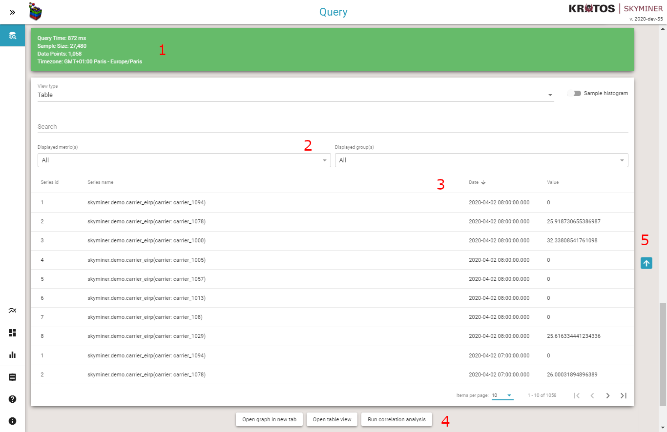
The indicator called Sample Size represents the number of data points that were processed by the query, before aggregation. Data Points are the objects actually returned in the response and plotted after aggregation.
Search and filters allow you to search for data or filter the query results:
Search: display data with a least one field matching the search term.
Displayed metric(s): you can choose to display all the metrics or select the one you want to display.
Displayed group(s): you can choose to display all the groups of the selected metric(s) or select the one you want to display.
The table header is interactive, you can sort the series by column values. To do so, click on the column header cell.
You can get a link to the graph. It is a way to save the query and re-execute it at any time by pasting the URL in your web browser. A link to the table is also available, it allows you to see the last values of the metric in a table view. The last option is to run correlation analysis with the query you created.
This button allows you to go back to the query editor.
Generated spectrum graph
If the view type named spectrum is selected, the resulting series are displayed in a spectrum graph.
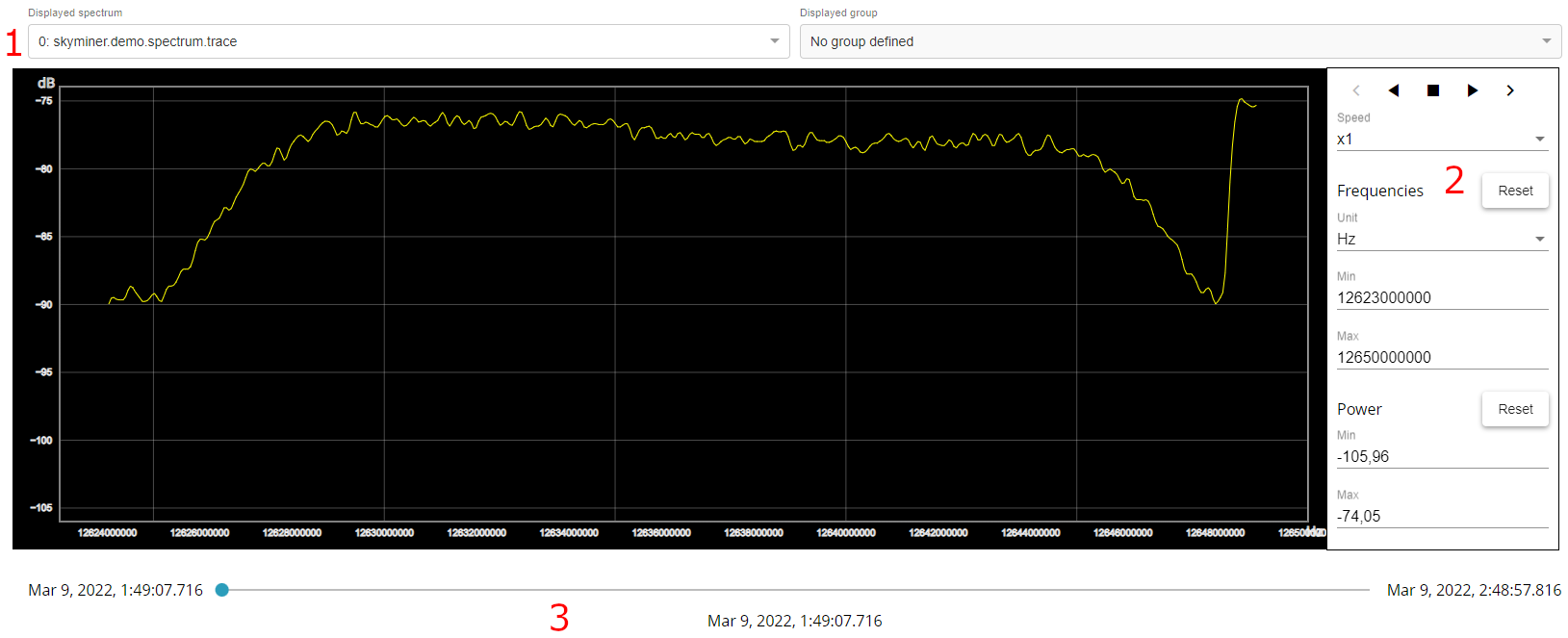
The input filters: you can select the traces to display on the spectrum graph.
Options of the spectrum graph:
Controls: play, pause, stop, next, …
Speed (x1, x2, x5, …)
Unit (Hz, kHz, MHz, GHz)
Frequency filter (min/max)
Power filter (min/max)
The time bar: permit to navigate through the time to display the wished trace.
Editor Mode
The query builder can be used in editor mode, notably in BIRT Electron app and in Correlation UI iframe.
This mode disables some features:
Export to CSV
Jupyter
Run correlation analysis
Open graph in new tab
Open table view